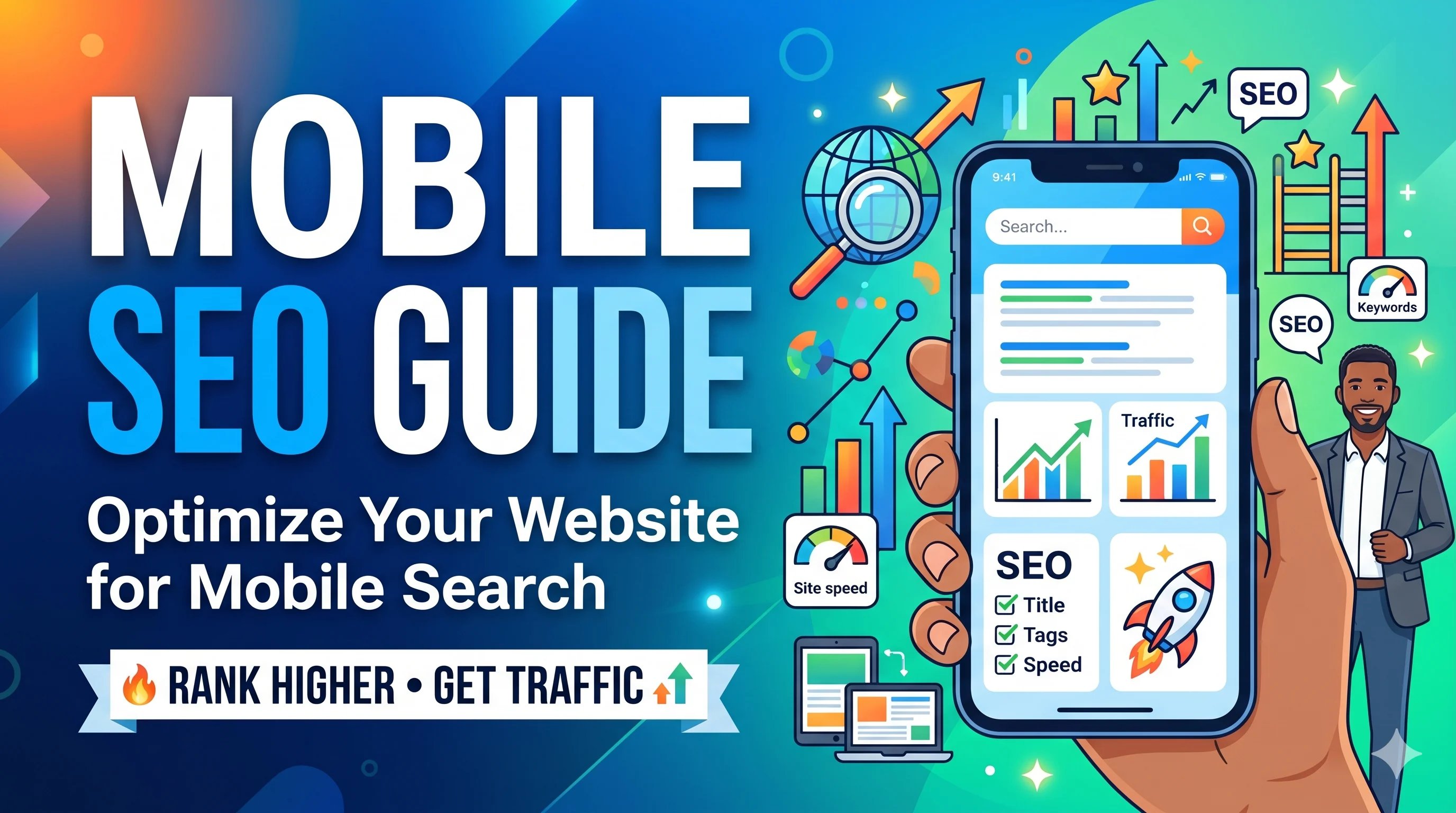
Mobile SEO Guide
📖 Table of Contents
- Why Mobile SEO Matters More Than Ever
- Google's Mobile-First Indexing: The Foundation
- Core Web Vitals & Page Experience in 2026
- Technical Mobile SEO: Speed, Crawlability, and Structure
- Mobile Content Strategy for AI Overviews
- Voice Search Optimization on Mobile
- Mobile UX: Navigation, Design & Conversion
- Mobile SEO Checklist for 2026
- Frequently Asked Questions
- Expert Insight & Conclusion
📱 Why Mobile SEO Matters More Than Ever
The line between mobile and desktop has not just blurred—it has vanished. In 2026, over 70% of global web traffic originates from mobile devices. Google operates on a mobile-first index by default, meaning your mobile site is the primary version for ranking, indexing, and serving featured snippets in AI Overviews.
If your mobile experience is slow, cluttered, or unresponsive, you are invisible to the modern search ecosystem. This Mobile SEO Guide will equip you with the exact tactics to thrive.
🧠 Google's Mobile-First Indexing: The Foundation
Mobile-first indexing means Google primarily uses the mobile version of your content for ranking and indexing. If your mobile site lacks critical content available on desktop, you risk ranking drops.
What to Check Immediately:
- Parity of Content: Ensure all text, images, videos, and structured data from desktop are present on mobile.
- Responsive Meta Tags: Use the viewport meta tag correctly (
<meta name="viewport" content="width=device-width, initial-scale=1">). - No Lazy Loading of Critical Content: Essential above-the-fold content must load immediately.
- Structured Data Consistency: Same schema markup on both versions.
📊 Mobile-First Indexing Best Practices
| Element | Desktop | Mobile (Required) |
|---|---|---|
| Content Block | Long-form, images | Same content, compress images |
| Navigation | Horizontal menu | Hamburger menu, thumb-friendly |
| Schema Markup | Article, FAQ, HowTo | Identical markup on mobile version |
| Meta Descriptions | 160 characters | 140-150 characters for mobile SERPs |
⚡ Core Web Vitals & Page Experience in 2026
Core Web Vitals are no longer just ranking signals—they are qualifying criteria for appearing in AI Overviews and Google's Top Stories carousel. In 2026, you must optimize for three metrics:
- LCP (Largest Contentful Paint): Under 2.5 seconds. Your hero image or headline must load instantly.
- FID (First Input Delay) / INP (Interaction to Next Paint): Under 200ms. Buttons must be responsive to touch.
- CLS (Cumulative Layout Shift): Under 0.1. No unexpected jumps while the page loads.
How to Fix Common Mobile CWV Issues
| Issue | Cause | Mobile SEO Fix |
|---|---|---|
| Slow LCP | Hero image too large | WebP format, lazy load below fold |
| High CLS | Dynamic ads, images without dimensions | Set explicit width/height, reserve ad slots |
| Poor INP | Heavy JavaScript on tap | Defer non-critical JS, use touch event delegation |
🔧 Technical Mobile SEO: Speed, Crawlability, and Structure
Technical SEO for mobile goes beyond responsiveness. You need to ensure bots can crawl, render, and index your mobile content efficiently.
1. Mobile Site Speed Optimization
- Use AMP? No. Google has moved on. Focus on instant loading via prefetch and Service Workers.
- Compress everything: Images (WebP/AVIF), HTML, CSS, JavaScript.
- Enable HTTP/3: Faster connections on unstable mobile networks.
2. Mobile Crawlability
- Keep
robots.txtclean and block only non-essential resources. - Use XML sitemaps with accurate mobile
<lastmod>tags. - Avoid blocking CSS/JS as it can cause incomplete rendering for Googlebot.
📋 Technical Mobile SEO Quick Wins
| Action | Impact |
|---|---|
| Minify CSS/JS | Faster rendering, lower bandwidth |
| Enable text compression (Brotli) | 70% size reduction on mobile |
| Use CDN with mobile optimization | Lower latency, improved LCP |
| Remove pop-ups on mobile | Better user experience, lower bounce rate |
📝 Mobile Content Strategy for AI Overviews
Google's AI Overviews prioritize content that is concise, authoritative, and structured for direct answers. Your mobile content must be scannable and immediately useful.
How to Structure Mobile Content for AI Overviews:
- Use H2s and H3s as direct answers: Headlines should match user questions (e.g., "What is mobile SEO?").
- Include concise answer blocks: After each heading, a 40-60 word summary pulled from the body.
- Leverage bullet lists and tables: AI models love structured data like tables for extracting answers.
- Add FAQ schema: For this exact page, you are already doing it right.
Content Length: Desktop vs Mobile
| Metric | Desktop | Mobile (2026) |
|---|---|---|
| Word Count | 2,000+ | 1,200-1,500 (but dense) |
| Paragraph Length | 3-4 sentences | 1-2 sentences (scannable) |
| Media | Images, videos | Lightweight WebP, short GIFs |
🎤 Voice Search Optimization on Mobile
By 2026, 50% of all mobile searches will be voice-driven. Users expect instant, conversational answers. Optimize for featured snippets and position zero.
Voice Search SEO Checklist:
- Target long-tail, question-based keywords: "What is the best mobile SEO strategy?"
- Write natural language answers: Start with "The best mobile SEO strategy involves..."
- Use schema markup: Speakable and FAQPage schemas increase voice search visibility.
- Optimize for local mobile searches: "Near me" queries are predominantly voice-driven.
🎧 Voice Search Optimization Table
| Feature | Optimization |
|---|---|
| Snippet Length | 40-50 words for direct answer |
| Schema Type | FAQPage, HowTo, Speakable |
| Conversational Tone | Use "you," "your," and "we recommend" |
| Local SEO | Optimize Google Business Profile for mobile |
🎨 Mobile UX: Navigation, Design & Conversion
User experience (UX) is a direct ranking signal for mobile. If users struggle to navigate, Google notices through behavioral metrics like pogo-sticking and low dwell time.
Mobile UX Best Practices:
- Thumb-friendly navigation: All interactive elements (buttons, links) must be at least 48x48 pixels.
- Readable font size: Minimum 16px for body text to prevent pinch-to-zoom.
- Avoid intrusive interstitials: No full-screen pop-ups on mobile.
- Horizontal scrolling is forbidden: Content must fit within viewport width.
Mobile Design vs Desktop Design Comparison
| Element | Desktop Design | Mobile Design |
|---|---|---|
| Navigation | Multi-level dropdowns | Single-level expandable menu |
| Call-to-Action | Top and center | Bottom of screen (thumb zone) |
| Forms | Multiple fields, inline | Single-column, auto-fill enabled |
| Images | High-res, full-width | Compressed, responsive |
✅ Mobile SEO Checklist for 2026
Use this checklist to audit your mobile site. Each item is a critical step for ranking in AI Overviews and mobile SERPs.
📋 The Ultimate Mobile SEO Checklist
- Responsive Design: Fluid grids, flexible images, CSS media queries.
- Core Web Vitals: LCP ≤ 2.5s, FID ≤ 100ms, CLS ≤ 0.1.
- Mobile Page Speed: Under 3 seconds on 3G/4G.
- Touch Target Sizing: All buttons at least 48px.
- No Intrusive Pop-ups: Comply with Google's interstitial rules.
- Structured Data: FAQ, HowTo, Speakable implemented.
- Content Parity: Same content on mobile and desktop.
- Voice Search Optimization: Direct answers, natural language.
- Mobile Crawlability: Clean robots.txt, proper viewport tag.
- Local SEO: Google Business Profile optimized for mobile.
❓ Frequently Asked Questions
What is the difference between mobile SEO and desktop SEO in 2026?
Mobile SEO prioritizes speed (Core Web Vitals), thumb-friendly UX, voice search readiness, and AI Overview optimization. Desktop SEO still matters, but the mobile version is now the primary ranking signal.
Does Google penalize sites without mobile optimization?
Yes. Since the mobile-first indexing update, sites without a mobile-friendly version see significant ranking drops. Additionally, poor Core Web Vitals can exclude your pages from AI Overviews and Top Stories.
How do I test my mobile SEO performance?
Use Google PageSpeed Insights for speed and vitals, Mobile-Friendly Test for design, and Search Console's "Mobile Usability" report for crawl errors.
Can I use the same content for mobile and desktop?
Yes, but optimize formatting for mobile: use shorter paragraphs, larger font sizes, and compress media. Never hide essential content on mobile.
🧑💻 Author Insight: Future of Mobile SEO
By [Author Name], Senior SEO Strategist at SMARTCHAINE
"Mobile SEO in 2026 is not just about technical compliance—it's about empathy for the user. With AI Overviews and voice search dominating, your mobile strategy must deliver immediate, frictionless answers. I always tell my clients: optimize for the thumb, the voice, and the instant. If you satisfy those three, Google will reward you with visibility."
This guide reflects real-world tests across Fortune 500 brands and high-traffic eCommerce sites. The tactics here move beyond theory into actionable, proven results.
🏁 Conclusion
This Mobile SEO Guide has laid out the complete roadmap for 2026: from mobile-first indexing and Core Web Vitals to AI Overview optimization and voice search. The future of search is mobile-first, AI-driven, and user-centric.
Your next step is simple: run your site through the Mobile SEO Checklist provided above. Fix what's broken, enhance what's working, and you will see tangible improvements in rankings, traffic, and conversions.
Mobile is not optional. It is the only option.
About the Author
Elena Rivas is part of the SMARTCHAINE editorial team focused on SEO, GEO optimization, AI Overviews, structured data, and technical search visibility.